
The Work
Brand identity, video production and social growth, 2021 to 2026. Built by Gabriel Parnell at Matchbox Media Management in Warwickshire. Select a project to see it in detail.
Oracle Boxing
Co-founder and Creative Director, October 2023 to November 2024.
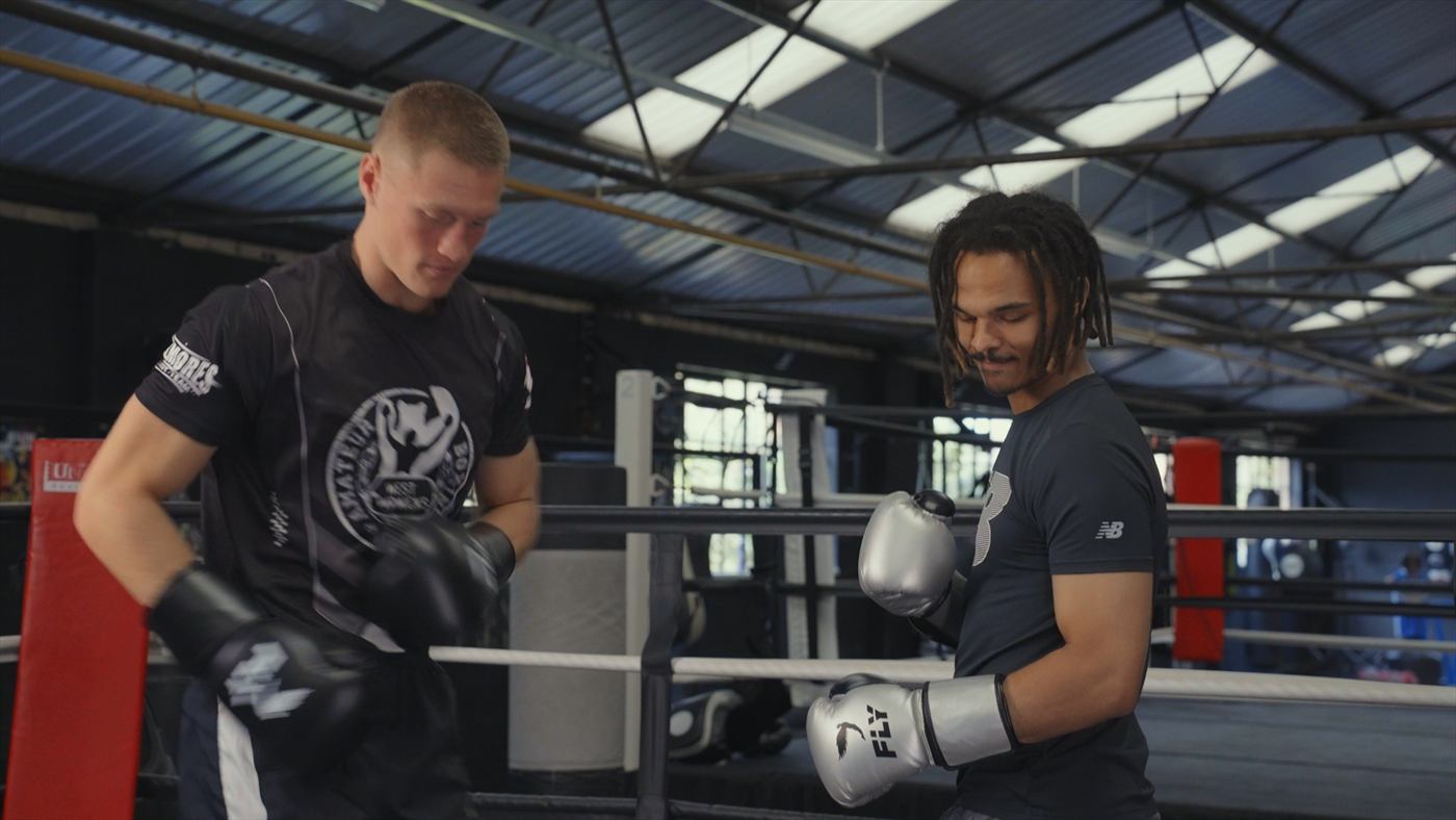
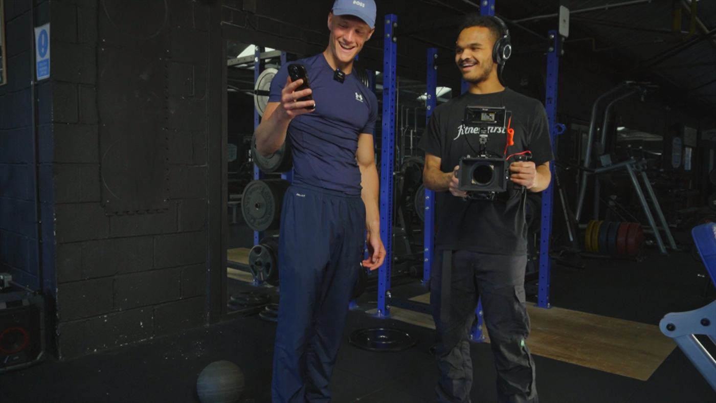
Two friends came to me with an idea to teach boxing online. I owned the media side of it end to end: concept, filming, editing, thumbnails, scheduling and publishing.
Both the YouTube and Instagram channels went from zero to over 100,000 followers each inside ten months. Growth was not luck. Hooks, pacing and retention were tested against the subscriber data every week and the format adjusted from what came back.
Alongside the channels I ran community management for a paid Skool community that grew into the thousands, and set the brand and creative direction for the business. I exited on good terms through a sale of shares in late 2024. The company continues to trade.
The Crown Inn
Brand identity and guideline sheet for a village pub.
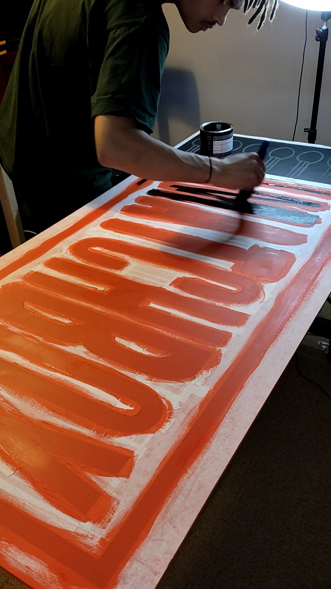
The crown and wordmark are redrawn from the sign already hanging outside the pub rather than invented from scratch. The palette comes from the building too: the near-black and gold match the hanging sign, and the fine red already appears as a border on the signage by the door. Using colours the pub already owns means a poster looks like it belongs in the room instead of fighting it.
Gupter echoes the lettering on the pub sign; Lato carries the small print because it stays legible on a phone. Both are free to install, so anyone the pub works with in future can match the brand exactly without buying a licence.
The strategic find was not visual. The Crown cleans its beer lines every week when most places leave it for six. Customers taste the difference but have no idea why, so the advantage was invisible. Made explicit, it changes behaviour: they choose the Crown over the pub down the road, and price stops being the thing they compare. Coasters were the first recommended spend, because a coaster sits in front of a customer for the length of a drink and often goes home with them.
The Brownie Goddess Co
Brand identity and guideline sheet for a small-batch bakery.
The logo works the same way the recipe does: two real ingredients and no filler. A cocoa bean for the 70% dark chocolate that goes into every batch, and a goddess for the woman making them. Those two shapes carry across the whole suite, so the brand reads the same stamped on a box lid or shrunk into a profile picture.
Cooper Black is 1970s American ice cream vans, chosen for the craving response rather than the nostalgia. Perpetua Titling is English, old and restrained, and carries the cottagecore side of the brand. It only survives at small size, so it is used sparingly and never fights the primary face.
The palette is named after the product rather than the swatch, so it works on a menu as well as in a guideline sheet: Blondie, Dark Chocolate, Milk Chocolate and Caramel. Caramel is the accent — ribbon, buttons, price, the inside of a folded box. Used least, it does the most work.
Matchbox
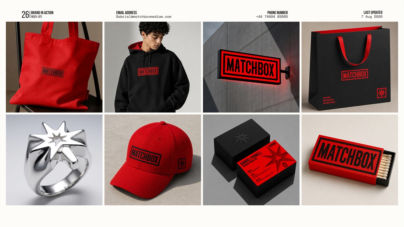
The identity system for my own consultancy. Twenty-seven pages, built to the same standard as client work.
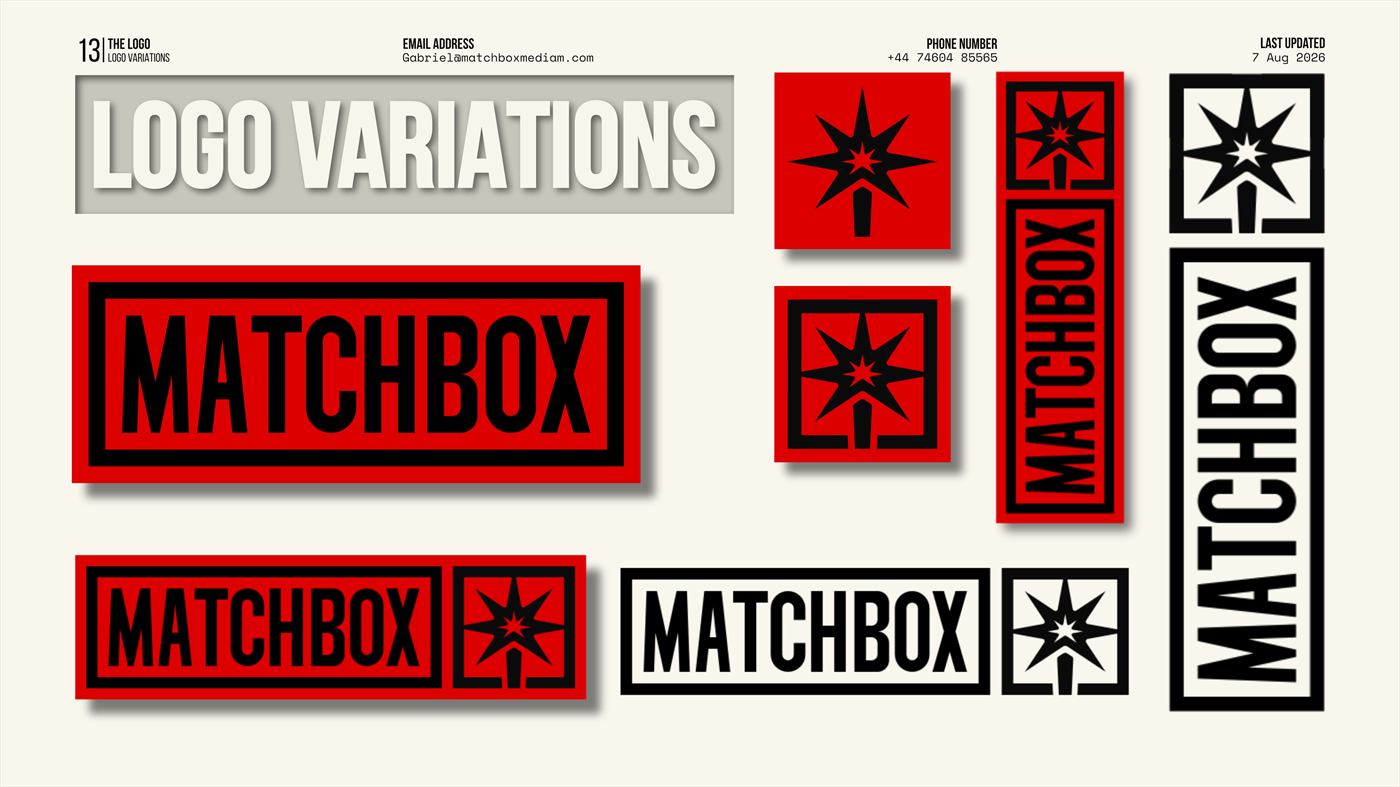
The mark has two parts. The wordmark is drawn on a grid with a consistent stroke weight, closer to a technical drawing than a typed word, and the letters live inside a box: a direct nod to the origin, a company born from a recording booth built in the shape of a matchbox.
The icon is The Spark, a seven-pointed compass star on a matchstick stem. Part north star for direction, part ignition. In the boxed version it also reads as a checkbox, except where a tick would mark something done, a star bursts out of it: something done exceptionally well.
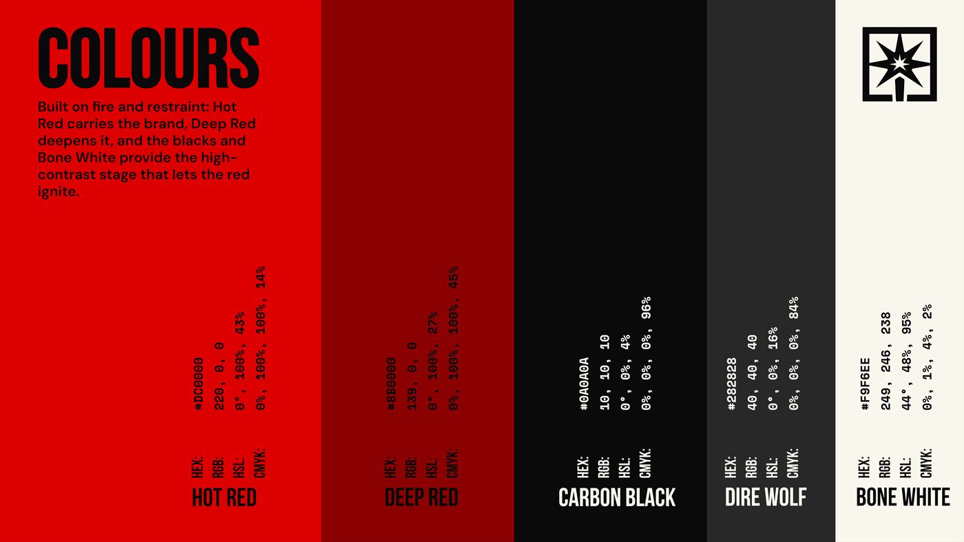
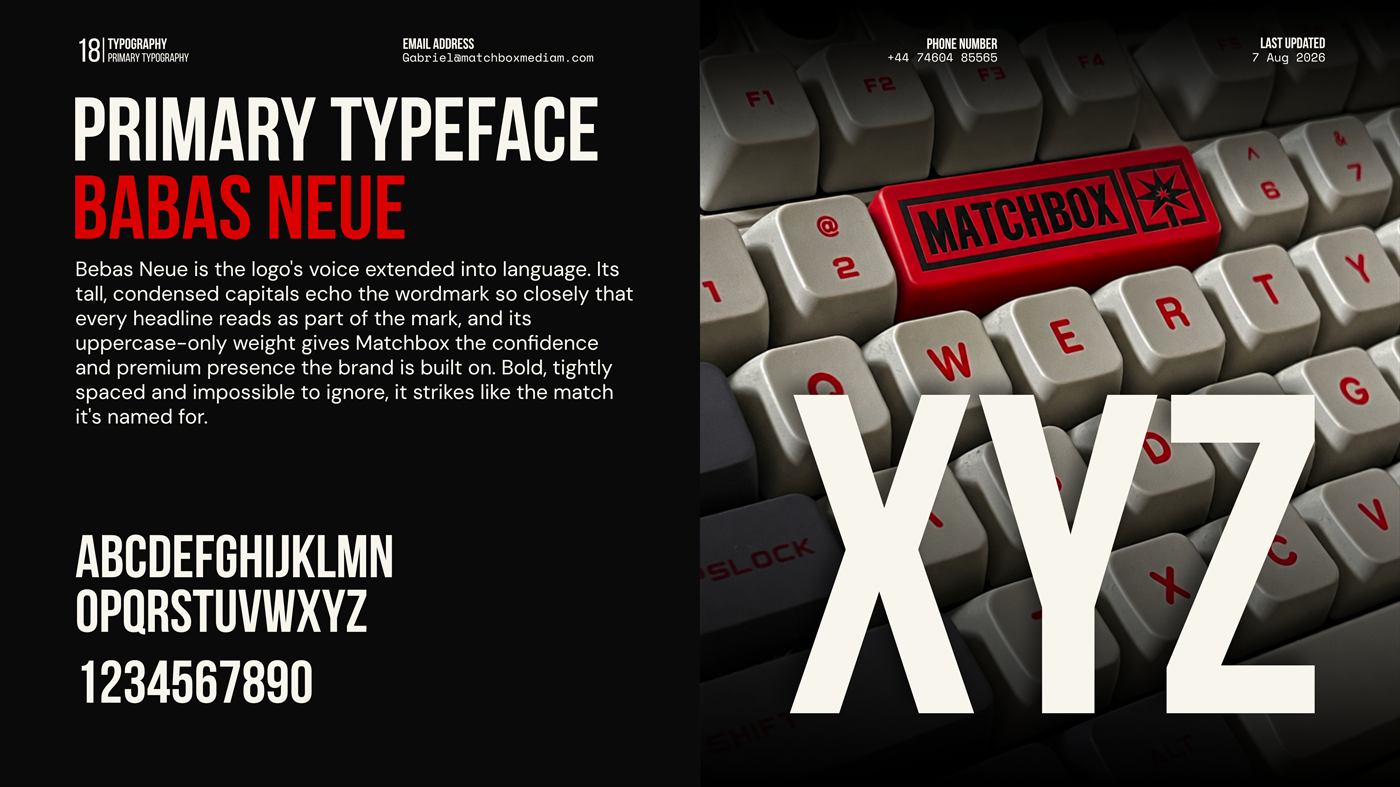
The palette is built on fire and restraint. Hot Red carries the brand, Deep Red deepens it, and the blacks and Bone White provide the high-contrast stage that lets the red ignite. Bebas Neue extends the wordmark into language, DM Sans carries the reading, and Space Mono gives the system its technical texture.
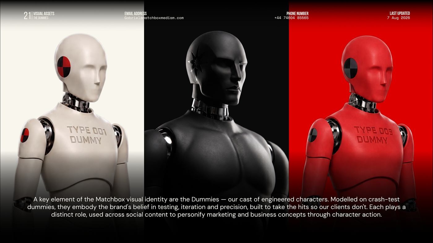
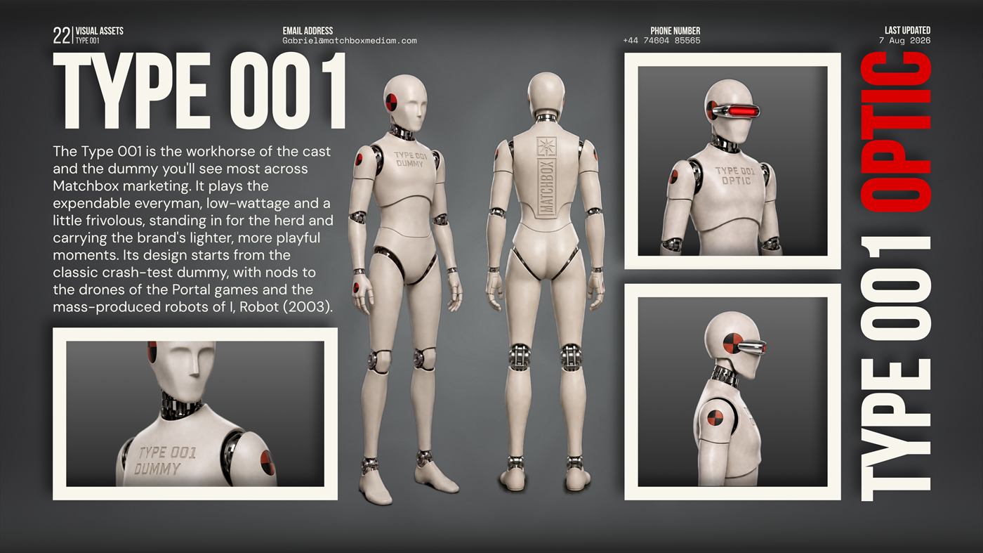
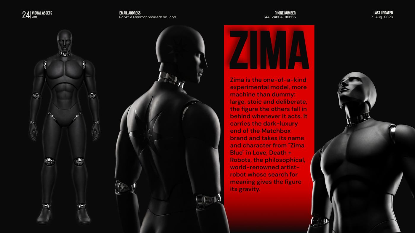
The identity also has a cast. The Dummies are engineered characters modelled on crash-test dummies, built to take the hits so clients don't: Type 001 the everyman, Type 009 the rare elite variant in the exact red of the logo, and Zima, the one-of-a-kind experimental model that carries the dark-luxury end of the brand.
Music Video & Podcast
Matchbox Media, 2021 to 2023.
Matchbox started as an artist management company to launch my brother's rap career, built in the evenings while I was still an apprentice at BMW in Munich. A podcast studio went up, and it turned into a media company producing music videos, event recordings and content.
Everything here was directed, filmed and edited in house. The videos below are the ones I am proudest of.
Ceelow — Brick Boy
Whizzy — CV ft. Cazzy
Ceelow — Violent Settings ft. KMizz
Get In Touch